Bookbaby Email
Background
Bookbaby is a company that offers authors services such as self-publishing, book printing, book cover design, and distribution. I have been on Bookbaby’s email list since October 2023.
Here is the email and the strengths and weaknesses, as I see them. Then I made a few suggestions for improvement. Enjoy!
Strengths
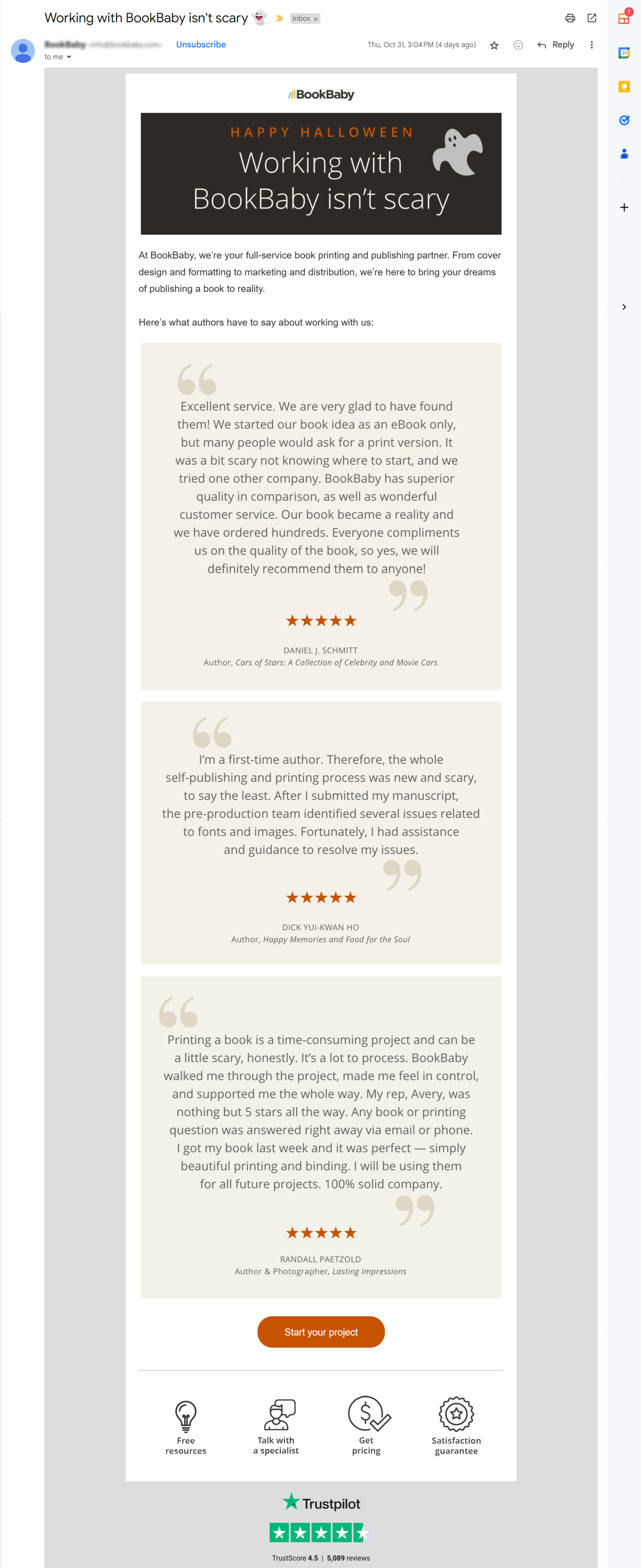
Overall, this email has a very nice, pleasing layout. It’s readable and easily scannable, which lowers the barrier to action for the reader. The three testimonials are written in a larger font, which also makes them easy to digest. They are also designed nicely.
The subject line tied in the recency of Halloween Day, the day I received the email. The ghost emoji made the email a bit more attractive to open.
Weaknesses
The top image in the email is 600 pixels wide. However, images smaller than 400 to 600 pixels wide tend to not flag the promo tab as often. So, I’d convert that image to a smaller size.
An overwhelming flag for the Promo Tab is that there are too many links inside the email. This email from Bookbaby contains 18 links—that’s right….eighteen active links. Every picture is linked, and all four of the icons are linked to a different section of their website.
The Trustpilot logo at the bottom of the email links to its website, as is the four-and-a-half-star rating.
Each of the three testimonials links back to the Bookbaby website. Even the large image at the top of the email is linked to the website.
The links are very overdone and may be helping their emails land in my Promo Tab.
The copy in the following section is not written as clearly as it should be: “At BookBaby, we’re your full-service book printing and publishing partner. From cover design and formatting to marketing and distribution, we’re here to bring your dreams of publishing a book to reality.”
Suggestions
Reduce the size of the top image.
Drastically reduce the number of links within the email.
The button: Start Your Project, should be one of only a few links within the email since that action is the action most desired by the company. Too many decisions (meaning: too many links) inside an email only confuses the reader and leads to inaction instead of action.
I’d rewrite the confusing body copy to be more along the lines of: “Bookbaby is your full-service book printing and publishing partner. We’ll take great care of your masterpiece manuscript from cover design and formatting to marketing and distribution. Our mission is to bring your publishing dreams to life.”
If you’re a business owner and have an email list with over 1,000 subscribers, contact me at nancy@nancybushagency.com if you’d like help avoiding the email mistakes you read about here.
